
Brand Guidelines.
How Spatial Construx looks, speaks, and shows up. In product, on the web, and everywhere in between.
Confident. Plain-spoken. Human.
Say the thing. Short sentences, concrete verbs, no jargon walls. If a reader has to re-read it, rewrite it.
We show, we don't hype. Skip "revolutionary" and "game-changing". The walkthrough makes the argument.
Address "you", in active voice. We talk like a sharp colleague on the project, not a vendor on a stage.
Claims tie back to what teams actually see and do: catch issues earlier, decide faster, skip the rendering.
Tone flexes by channel: more technical with BIM managers, warmer with owners, always plain. Avoid em dashes in body copy; use a colon, a period, or a middot separator.
The Sphere and the wordmark.
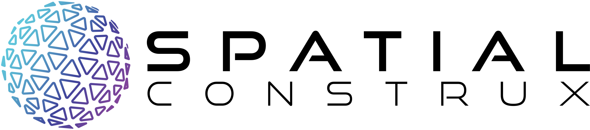
The mark pairs the Sphere, a lattice of facets resolving into form, with the wordmark set in Michroma. The gradient lives only in the Sphere. The wordmark stays solid: black on light, white on dark.

Square and narrow placements: social, print collateral, merch.

Same lockup with the white wordmark for dark surfaces.

Favicons, avatars, app tiles, watermarks. Never the first impression.
Clear space equals the cap height of the "S" in SPATIAL on all four sides. Nothing enters it: no type, no edges, no other marks.
Below minimum width, switch to the next smaller form: rectangle to square, square to Sphere.
Michroma marks. Poppins speaks.
NOPQRSTUVWXYZ
0123456789 (&?!/,:;-_*)
One weight, always uppercase, wide tracking (.16em to .34em). Michroma is the voice of the wordmark: reserve it for eyebrows, section labels, spec callouts, and page furniture. Never for paragraphs. It succeeds "Good Times" from earlier brand documents.
Deep space, lit by the gradient.
The signature gradient. Always 95°, always this stop order: cyan light falling into violet depth. On light surfaces, accent text uses Indigo #3F439A or Violet #85439A. Both are real stops on the ramp and both clear AA; the cyan end does not.
Compositions are mostly calm neutral surfaces. The gradient is the 5%: the accent that makes the rest feel deliberate.
Cyan #60C9DD on white is 1.9:1. Never use it for text on light surfaces. Use Ink, Indigo #3F439A, or Violet #85439A instead.
The signature dark surface.
Deep Space lit by two soft glows: violet from the bottom left, cyan from the top right. After the logo, this is the brand's most recognizable asset. Never a hard gradient, never saturated, never centered.
Violet .15, cyan .12. The default for any dark page or section.
Violet .22, cyan .18, plus a teal .12 accent. First impressions only.
background:
  radial-gradient(ellipse 55% 44% at 10% 88%, rgba(122,63,158,.15), transparent 62%),
  radial-gradient(ellipse 50% 42% at 90% 12%, rgba(63,159,212,.12), transparent 62%),
  #04040b;
Available as the token --sc-surface-dark (and --sc-surface-dark-strong) in the design system.
Glass, pills, and thin strokes.
Fill rgba(255,255,255,.06) · border rgba(255,255,255,.14) · blur 22 saturate 150% · radius 24. Dark surfaces only.
24 px grid · 1.7 px stroke · round caps and joins · outline only, no fills · drawn in currentColor so icons inherit text color.
The brand on one page.
For partners, vendors, and anyone shipping something with our name on it. When in doubt, this section is enough.


Black wordmark on light, white on dark. Clear space: the "S" cap height. Minimum 140 px / 32 mm wide. Never recolor, distort, or re-set the type.
Neutral surfaces carry the design. The gradient is an accent: key words, hairlines, one hero element. Never body text, never below 24 px.
Logo files, fonts, and templates ship in the brand kit. Anything unclear, or a use case this page doesn't cover: marketing@spatialconstrux.com
Get the logo files.
Every file has a transparent background. Pick the light version for light backgrounds and the dark version for dark ones. Use SVG or PDF wherever you can: both are vector, so they stay sharp at any size.















The icon is never the first impression: use a full lockup wherever there is room. At 32 px the sphere is a favicon, not a logo.
All lockups and icons, in every format and size, in one archive.
Download the full logo kit ↓